Steve Zissou @SteveZissou@social.cleverlibre.org
Steve Zissou
boosted

 🏳️🌈🖖🏽
🏳️🌈🖖🏽
Mike Pence is an example of toxic Christianity. We should have freedom of religion, yes, but we must also ensure freedom *from* religion. Your religious freedoms don’t give you the right to deny freedoms or civic participation to others. Period.
Steve Zissou
boosted

#30DaysMapChallenge
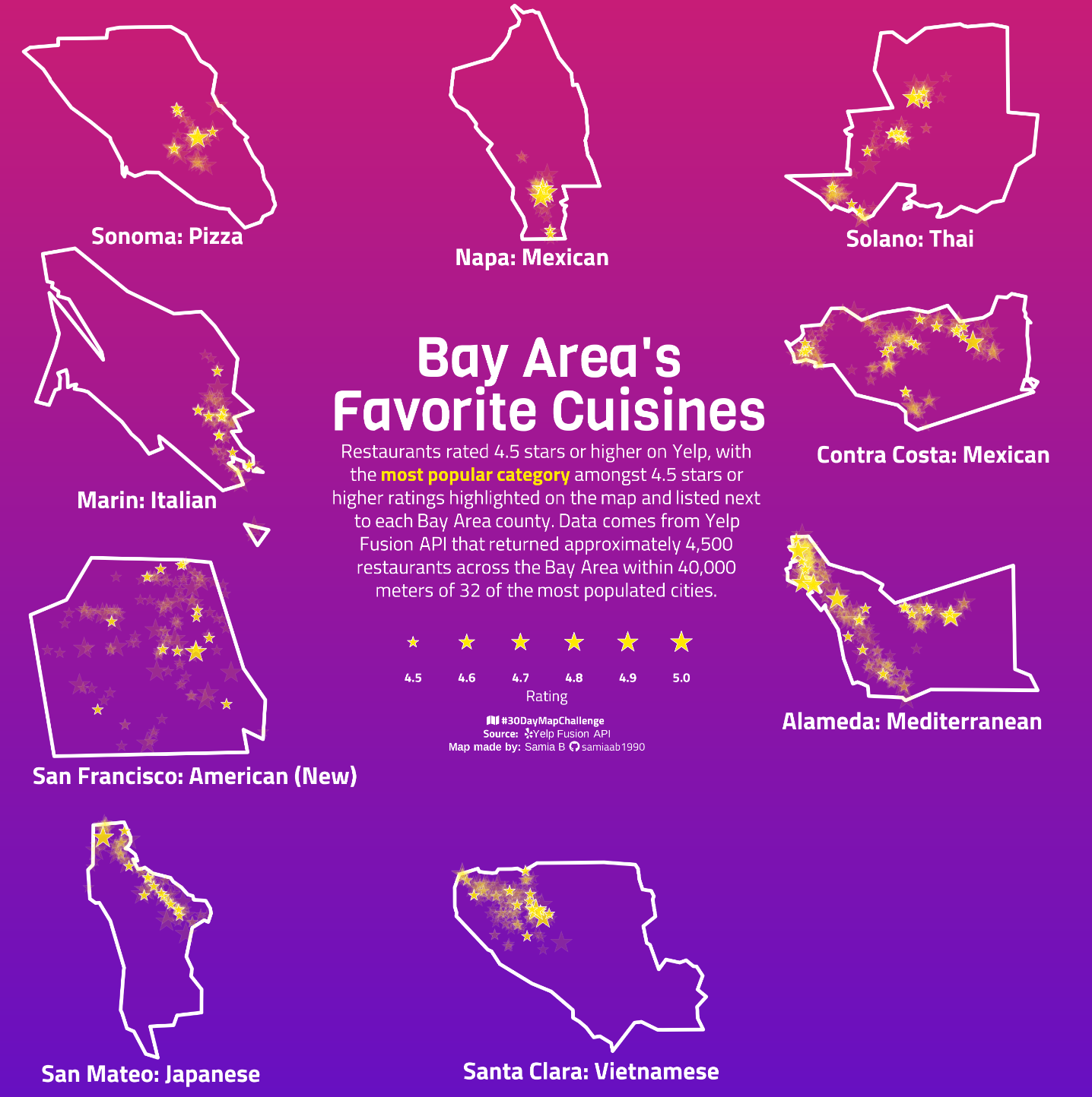
Day 15- late post of food and drink
Bay Area Restaurants rated 4.5 and more with the most popular top rated cuisine in each county highlighted on the map. Data from Yelp Fusion API.
Made using #RStats
#DataViz #DataVisualization #maps #GIS
Steve Zissou
boosted

Perceptive post by Sarah O’Connor in the FT, with quotes from labour lawyer @valeriodestefano
Tech workers were sold a dream where unionisation would not be needed because they already had a meaningful and well paid job, but the recent lay offs at Meta, Twitter and Amazon expose a different reality - showing how ‘benevolent dictatorships seem fine until they’re not so benevolent anymore’
https://www.ft.com/content/b6fdff1c-94a1-41d6-ae52-5dcbffa5dcea
Steve Zissou
boosted

Steve Zissou
boosted

In science news:
Researchers in Israel have found what they say is the earliest evidence of #fire being used to cook - a key point in human #history. The study suggests our early human ancestors were cooking well-done fish nearly 800 000 years ago (prev research ind. less than 200 000). A 16 year study at a prehistoric lake site in N Israel found that changes to the enamel of fish teeth suggested they had been subjected to temperatures of between 200-500 C - the right range for well-cooked fish.
Steve Zissou
boosted

We gave rocks anxiety, and they gave us depression: a programmer's memoir.
Steve Zissou
boosted

Steve Zissou
boosted


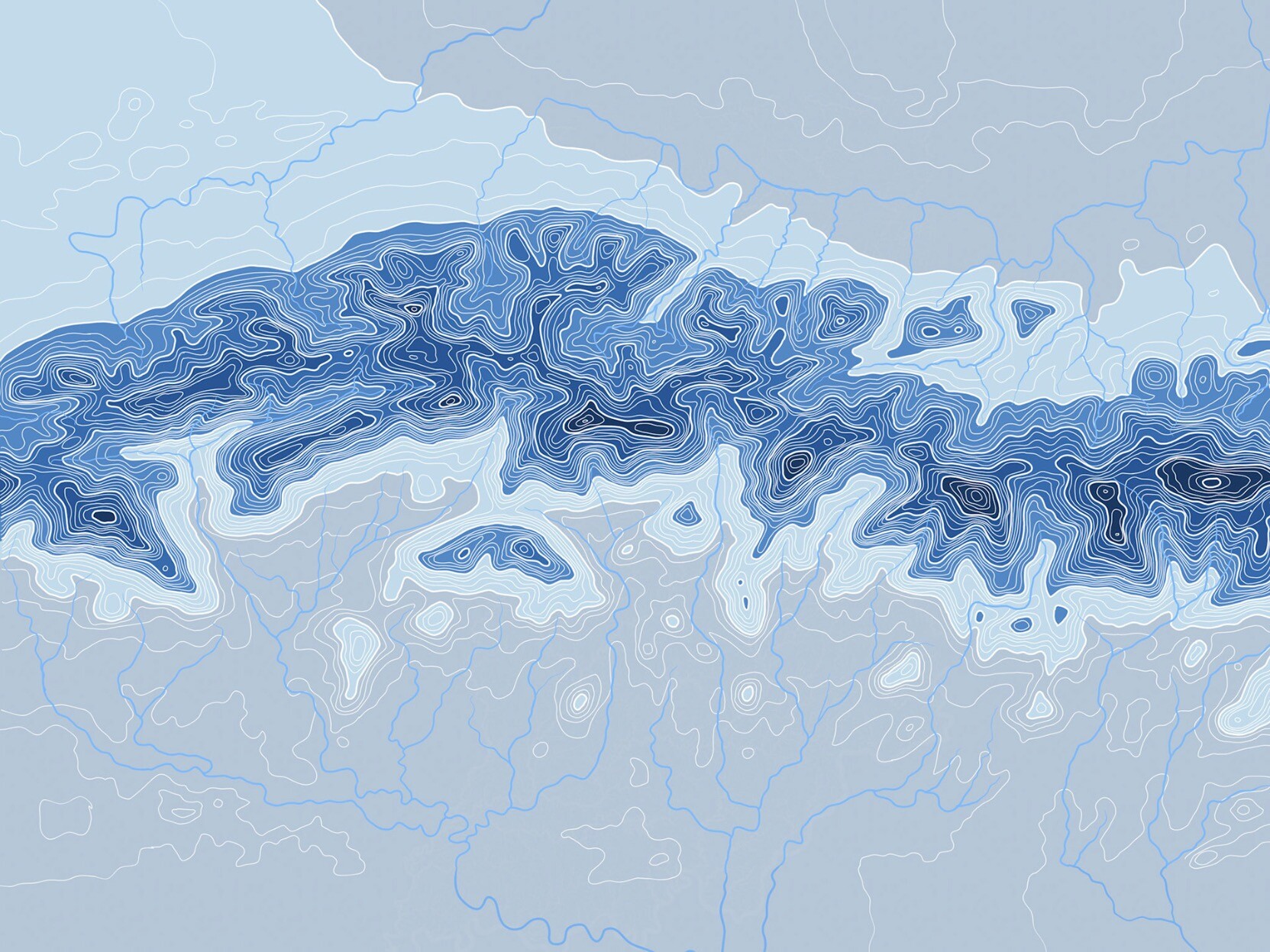
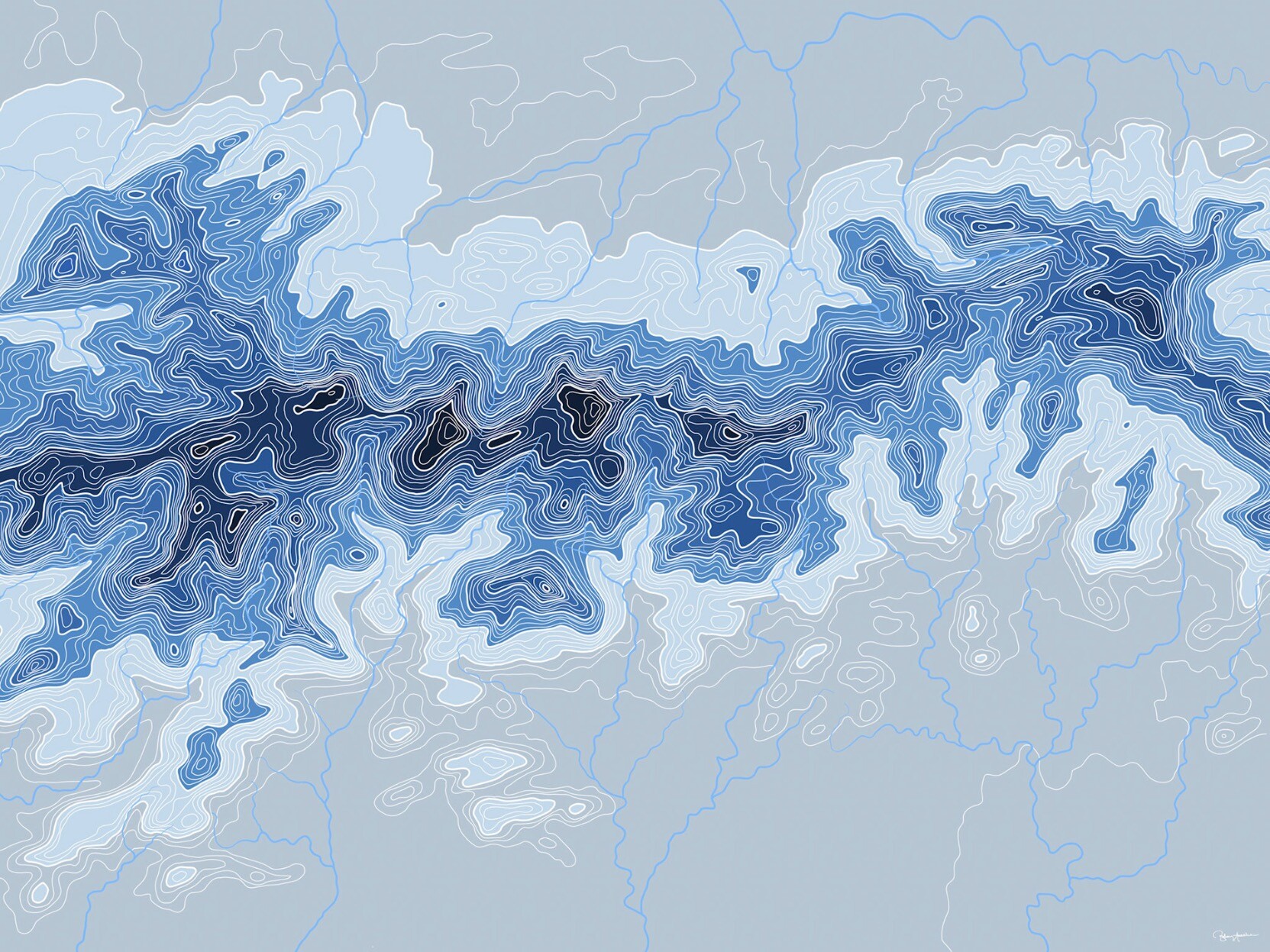
And here's another one of my massive, two foot by six foot hand-drawn topographic maps, this one of Shenandoah National Park. These take me about two weeks to hand-draw all the lines and then add color. The southern end of the park is on the left, the north is on the right.
Steve Zissou
boosted

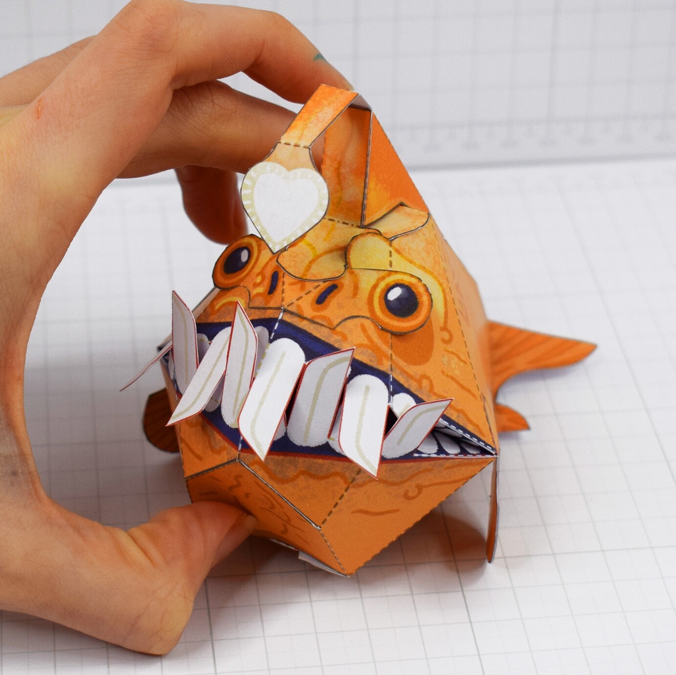
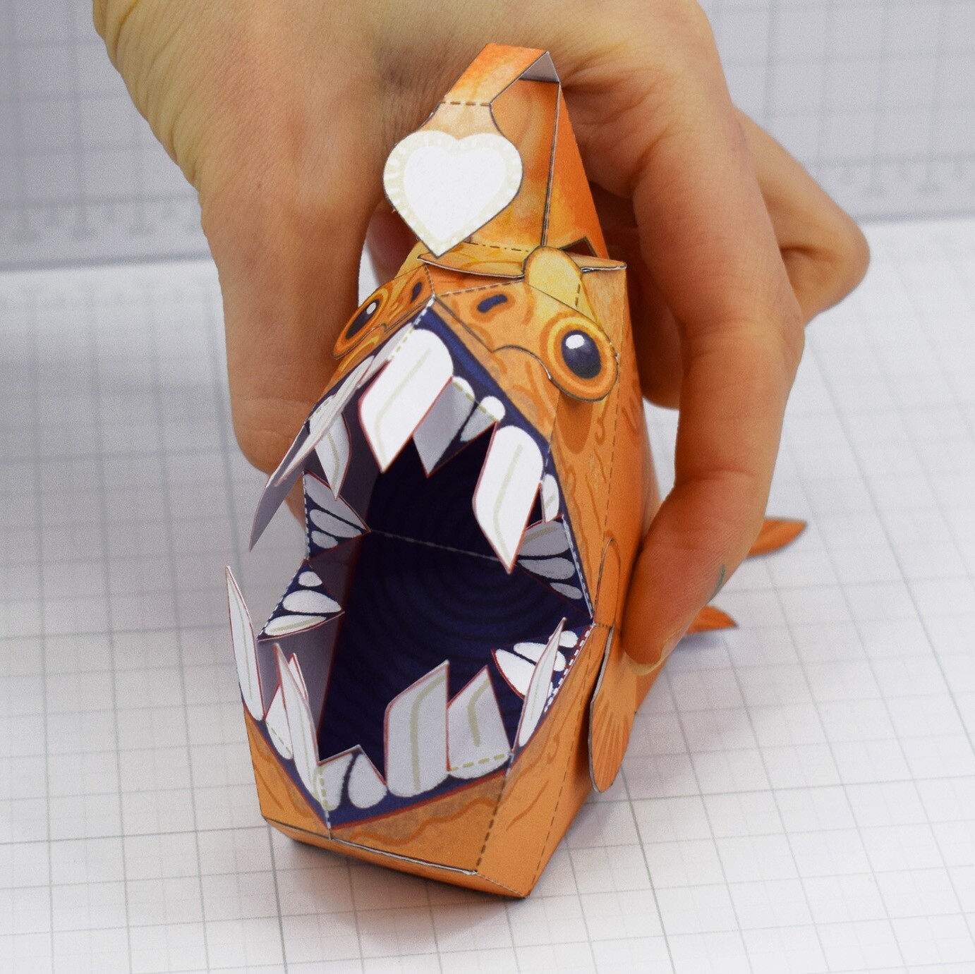
open wide little anglerfish
#papercraft #papertoys #folduptoys #illustration #art #3d #craft #fish #art #artist
Steve Zissou
boosted

I used to work at a company where as part of an SRE oriented team (a core of well versed professional full-time SREs and multiple volunteers across different time zones) you would undergo training sessions the best part of which is a scripted reenactment of some previous large scale incident (usually with some embellishments and such). You get on zoom and a bunch of people role play stuff breaking, so you have to chose to take some actions to mitigate and dig the system out of the feces.
Steve Zissou
boosted

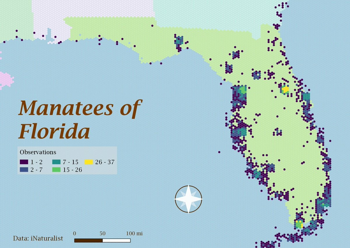
Today is hexagon day for the #30DayMapChallenge. Excited to head down to see family in Orlando next week for Thanksgiving and hoping we can fit in some manatee viewing time.
Steve Zissou
boosted

Steve Zissou
boosted

If disaster does not strike, on Friday we are launching the largest houseboat ever to float on the Loire river. This is a very accurate drawing of what it looks like. Photos will follow - we hope.
Steve Zissou
boosted

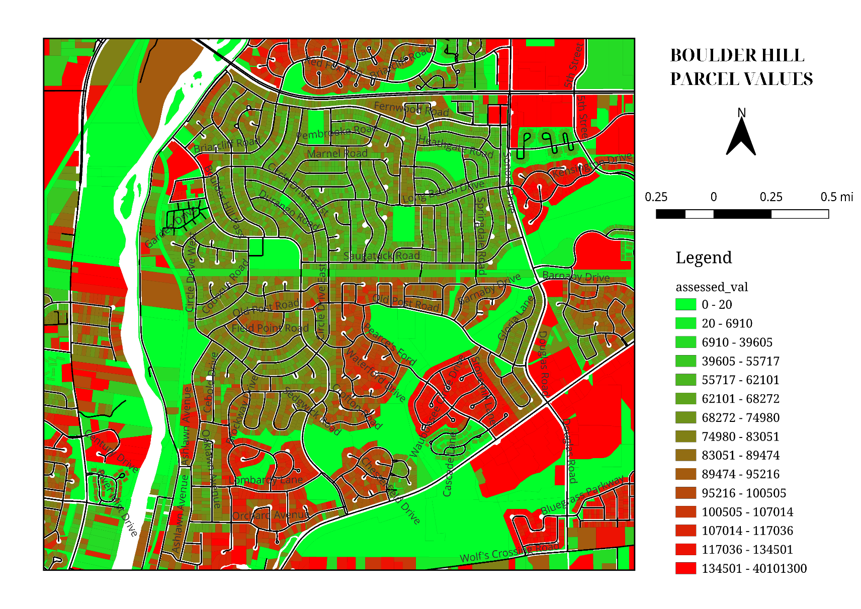
#30DayMapChallenge
Day 10 - Bad Maps
Tried to shoehorn as much bad as I can in one map. While nothing "in the wild" goes this far, too many of these attributes are still easy enough to find.
- Colorblind-unfriendly color scheme
- Too many symbol classes
- Numeric attribute visualized on polygons
- North arrow and scalebar for a non-navigation map
- Parallel street labels with no halo
And it pains me to admit it, but the streets come from #OpenStreetMap, and I didn't provide attribution. Bad!
Steve Zissou
boosted
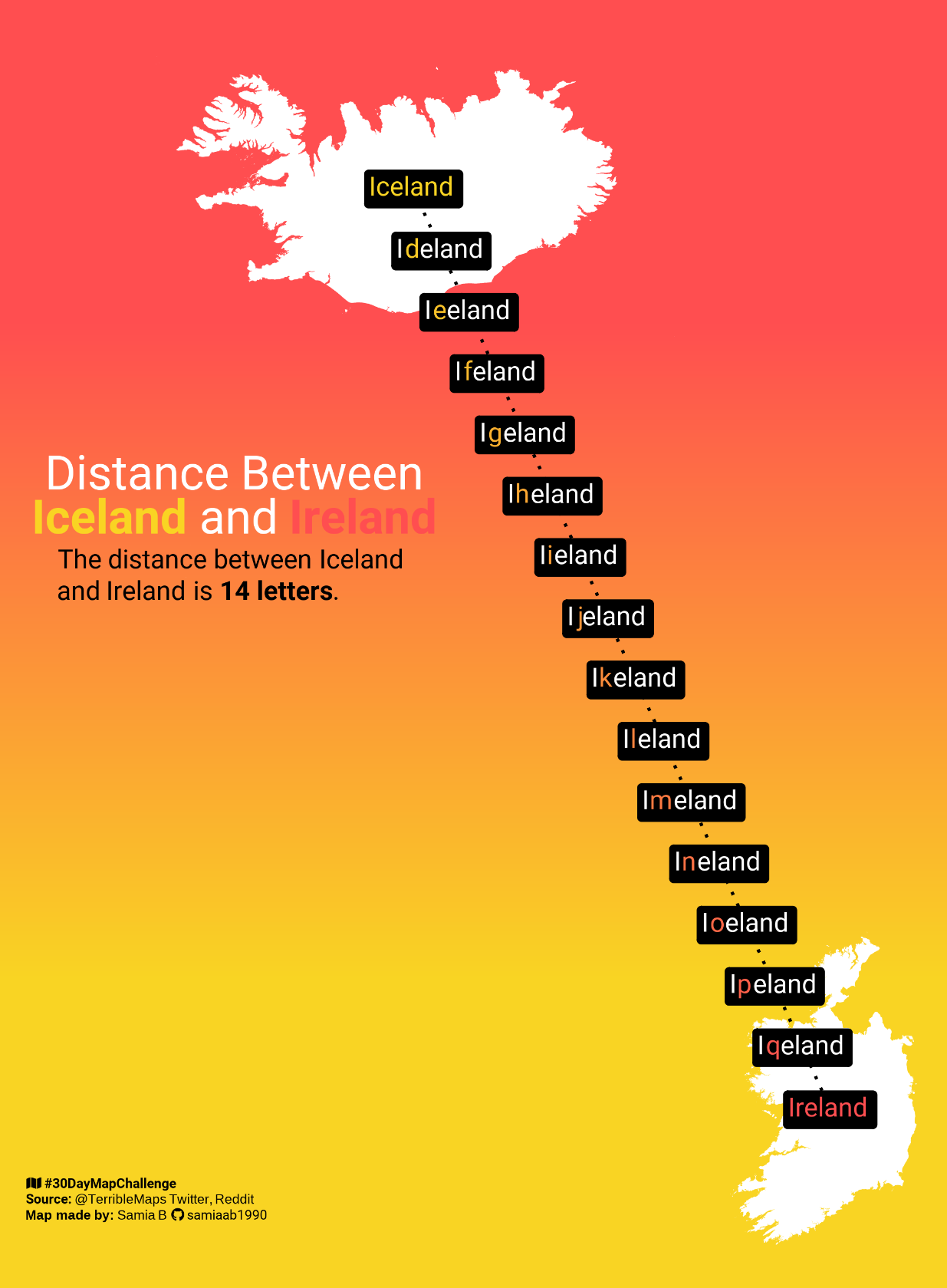
#30DayMapChallenge
Day 10: A bad map
Inspired by
@TerribleMaps
Made using #RStats
#dataviz #DataVisualization #maps #GIS
Steve Zissou
boosted

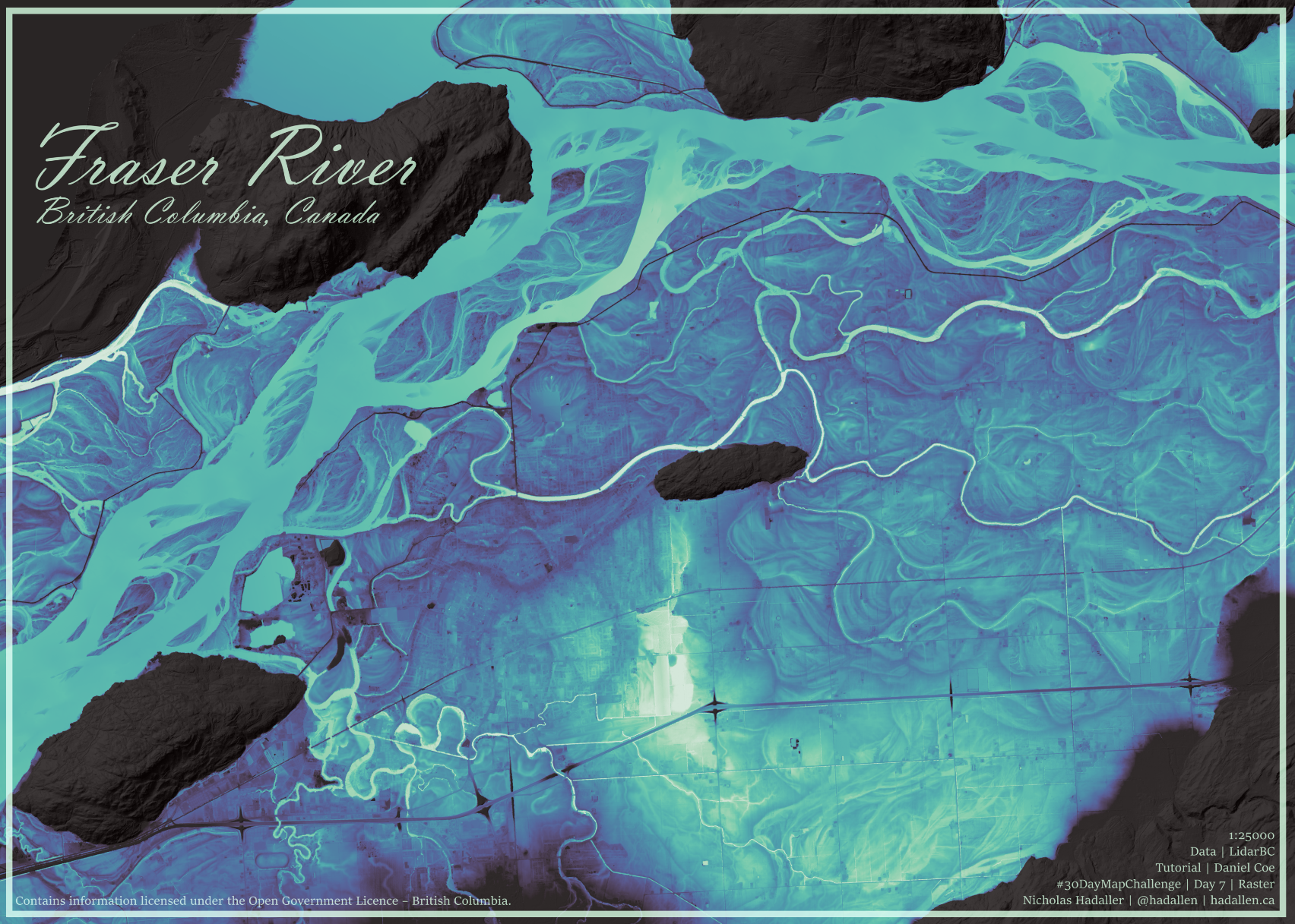
#30DayMapChallenge - Day 7 - Raster
I've been wanting to try following Daniel Coe's REM tutorial for awhile now - Figured this is the best time to try! I couldn't get mine as pretty as his though!
Steve Zissou
boosted

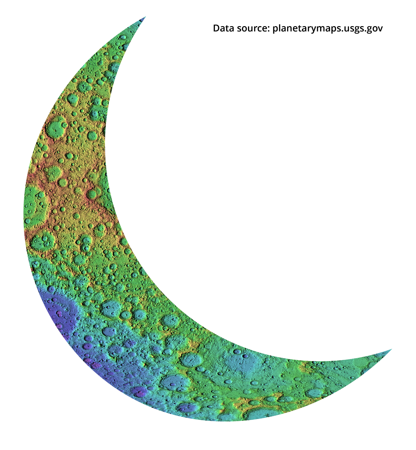
#30DayMapChallenge day 9: Space
A moon shaped lunar relief map
Steve Zissou
boosted

#30DayMapChallenge / day 12: "scales"
French « départements » at the same size but tidily ordered by area.
Steve Zissou
boosted
#30DayMapChallenge / day 13: "5 minutes map"
Sugar cane fields in La Réunion
Steve Zissou
boosted

Not your keys not your coins