

Jack Kennedy 🐀 @_jcken@social.cleverlibre.org
- https://twitter.com/_jcken
I have a stats PhD from Newcastle and work as a senior data scientist at UKHSA
Royal statistical society volunteer
🌲 🐕 🚵♂️ | views own | he/him
Joined Nov 2022
@DToher the weird thing is they've not objected to the use of colour, but rather the fact I've said (something similar to) "the black line is the truth, the dotted red line is the estimate". They'd prefer "the line is the truth, the dotted line is the estimate" 🤷♂️
Journal asked me to remove reference to colour in figure captions as this is inaccessible? There's _also_ a description of line/plotting character type. Seems stupid as my short-sightedness makes distinguishing by colour much easier than by e.g. line type
Jack Kennedy 🐀
boosted

The bests stats commentary category for this year's Journalism Awards recognises excellent statistical contributions to the public debate by non-journalists.
Other awards (for #journalists) are:
Data Visualisation #DataViz
Explaining the facts
Investigative Journalism
✍️Nominate by 20 March - either self, or of someone else's work!
Work published in 2022, in English anywhere in the world. (2000 words/10 mins max)
Info: https://rss.org.uk/training-events/events/excellence-awards/journalism-awards/
Jack Kennedy 🐀
boosted

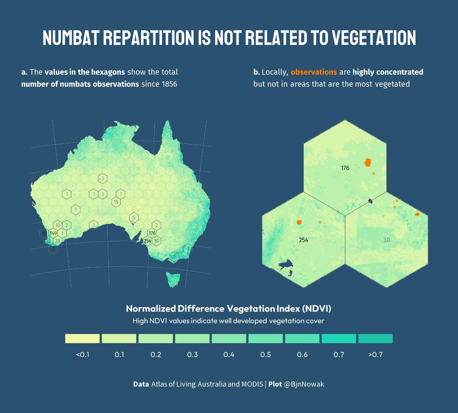
Mixing #TidyTuesday with vegetation index from multispectral images (the kind of data I use most frequently at work!) to test if numbats distribution is related to vegetation, at national and local scale. Answer in plot below...
#RStats code https://github.com/BjnNowak/TidyTuesday/blob/main/SC_numbats.R
@BjoernHolzhauer I can believe rstanarm/brms/prophet etc are used more often since easier to work with! Where I work, we offer stan training courses and it's almost always academics who come, so was interested to see if there's a need elsewhere
Jack Kennedy 🐀
boosted
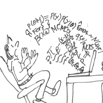
@_jcken @mcmc_stan There seems to be a lot of use of Stan in the industry. The first two examples that come to my mind are Pharmacometrics ---we have some examples in Section 1.1 of this paper (https://ascpt.onlinelibrary.wiley.com/doi/10.1002/psp4.12812); and forecasting in tech, notably via the software Prophet (https://facebook.github.io/prophet/) built on top of Stan.
@robertGrant@vis.social thanks - these look great
@robertGrant@vis.social @mcmc_stan private sector! or public services. Any real world impact really
interested to hear if anyone is using #stan @mcmc_stan in industrial settings? Can be based in industry or academic collaboration
Jack Kennedy 🐀
boosted
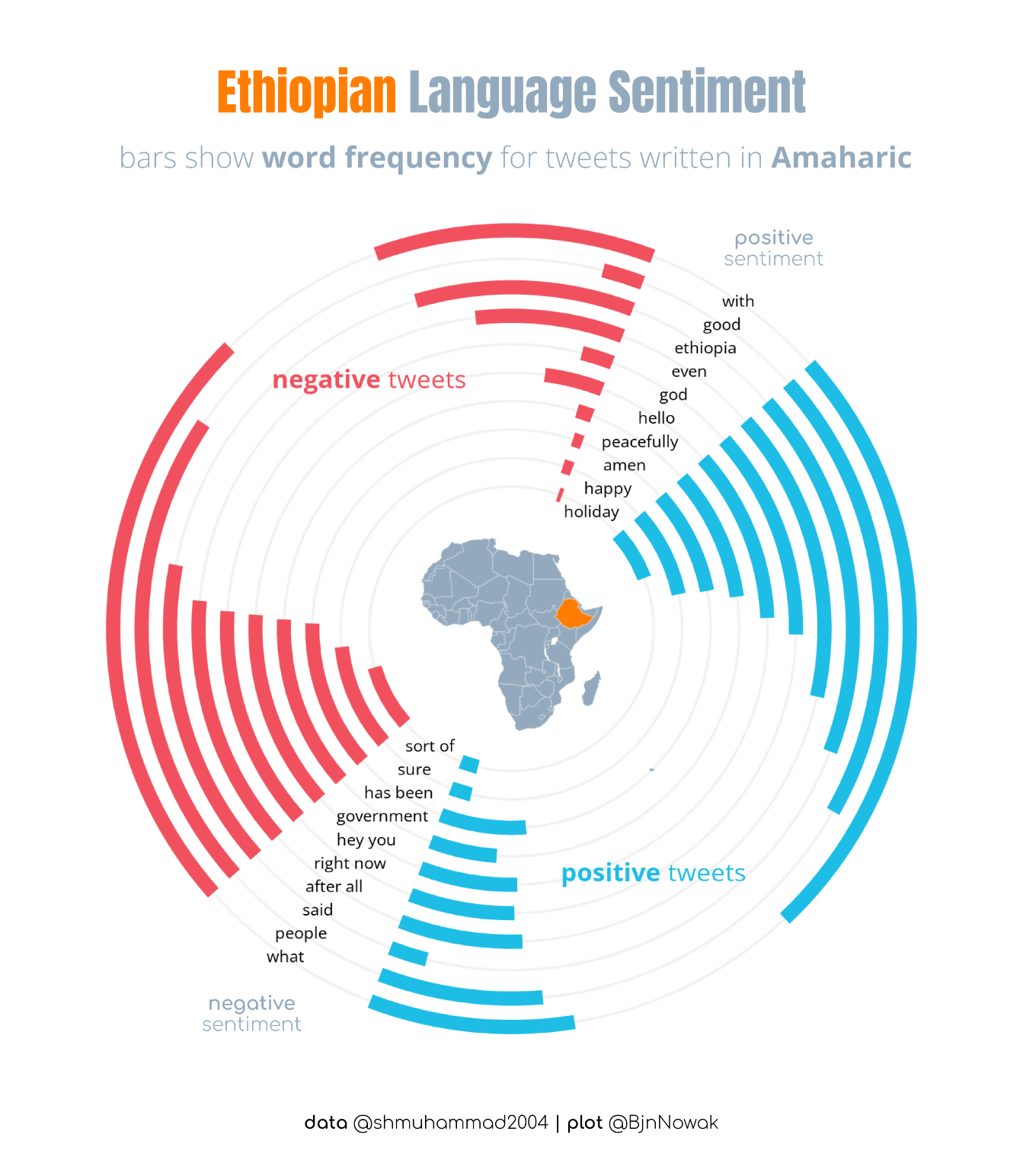
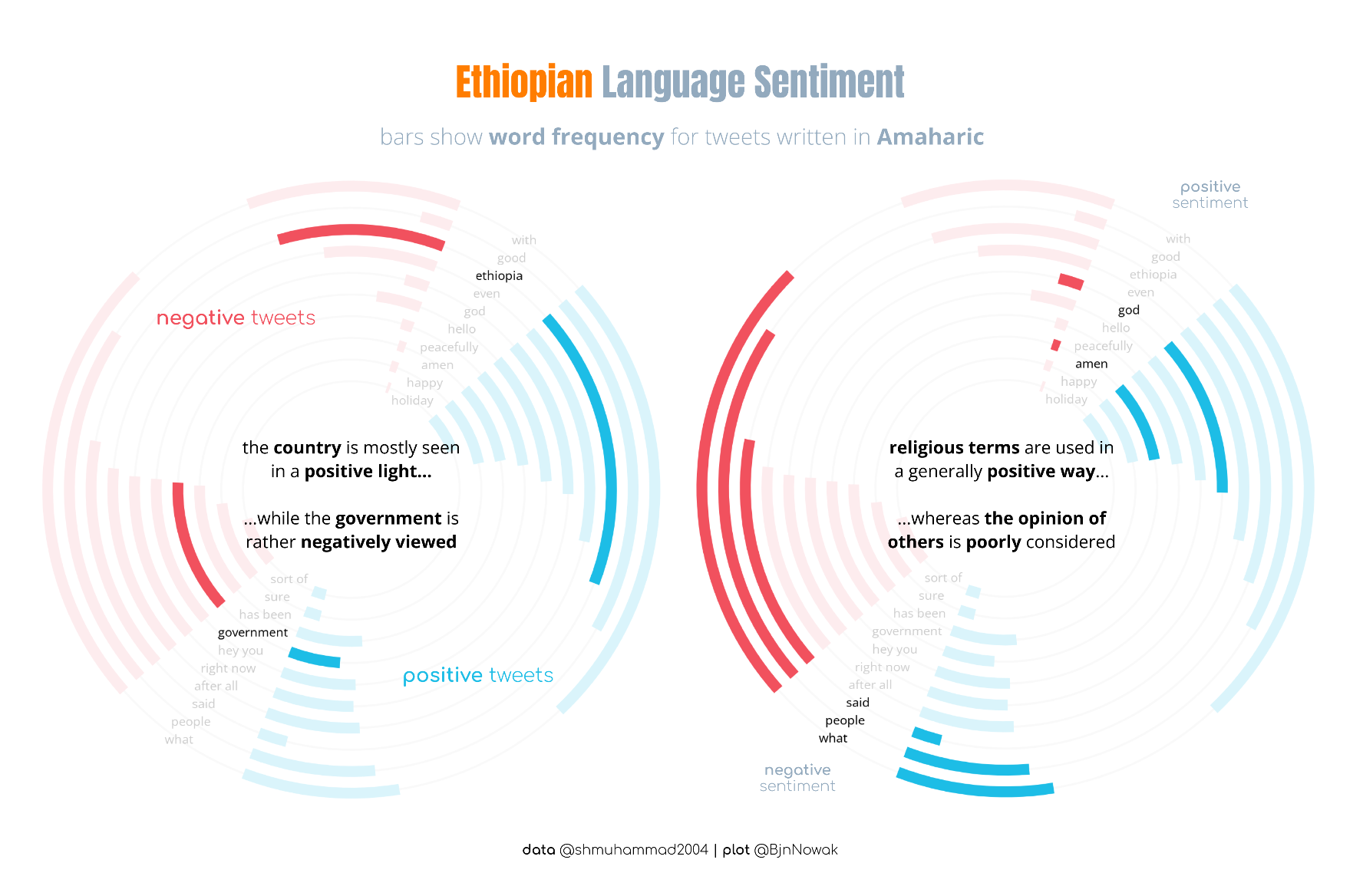
Ethiopian Language Sentiment analysis for #TidyTuesday : religious terms are mostly tweeted in a positive way, whereas the opinion of others is poorly considered...
#RStats code at https://github.com/BjnNowak/TidyTuesday/blob/main/SC_language.R
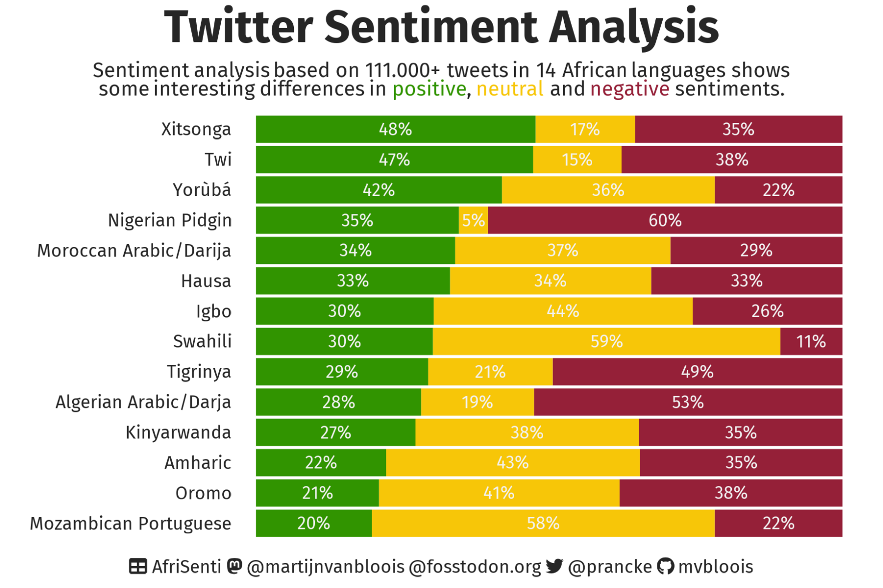
Managed to do a #TidyTuesday for the first time in a few weeks. Sentiment of tweets is mostly negative!
Code: https://github.com/jcken95/tidytuesday/tree/main/2023/2023-02-28
AfriScenti paper (pdf): https://arxiv.org/pdf/2302.08956.pdf
Jack Kennedy 🐀
boosted

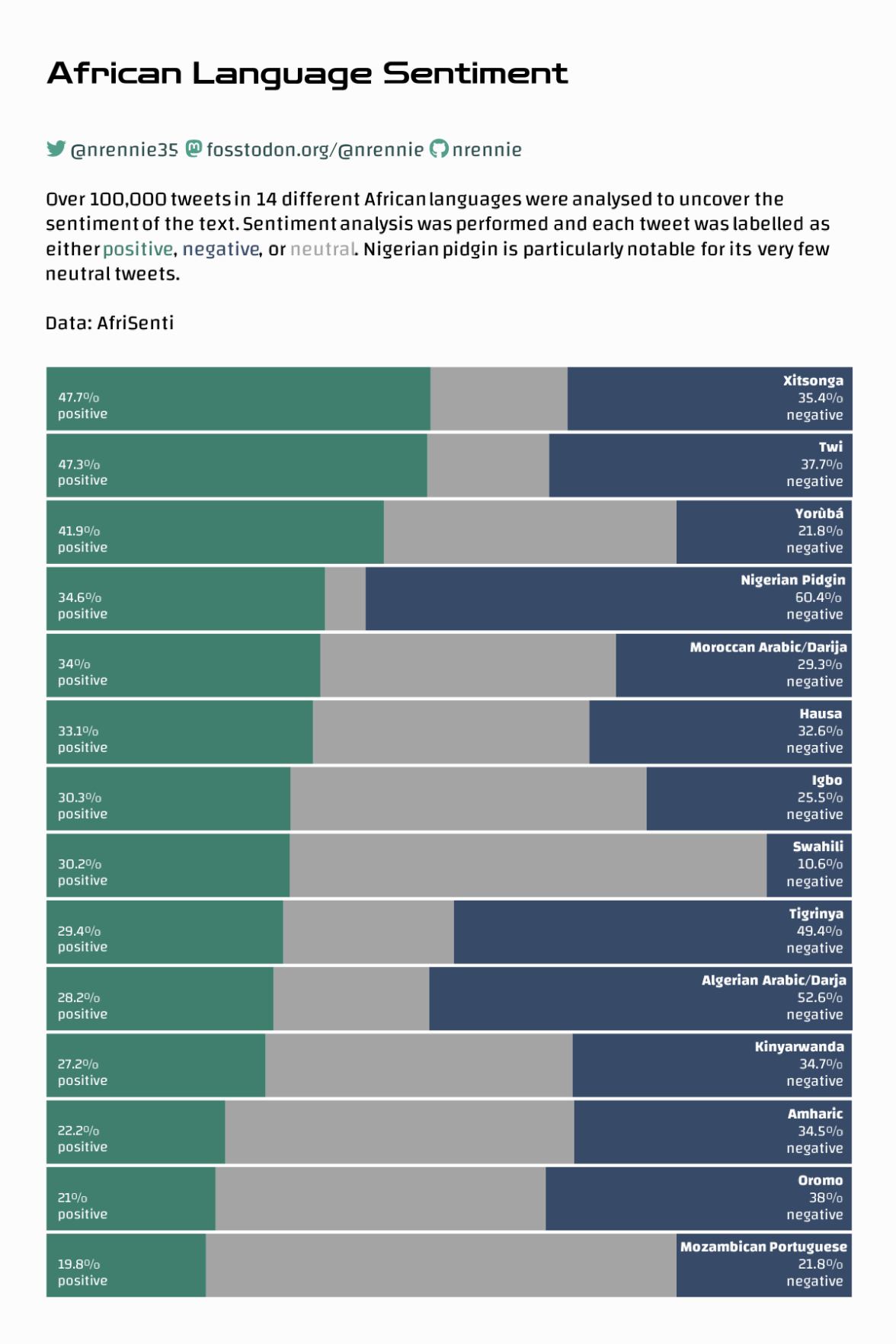
This week we look at sentiment analysis in 14 African languages. #TidyTuesday
Special thanks to @Shmuhammadd for providing the datasets. Read his paper at https://arxiv.org/pdf/2302.08956.pdf
Jack Kennedy 🐀
boosted

It's #TidyTuesday again! Thanks to Shamsuddeen Hassan Muhammad for sharing the data this week on African language sentiments 🌍
I made use of {ggtext} again this week to try some alternative approaches to labelling bar charts! 📊
Code: https://github.com/nrennie/tidytuesday/tree/main/2023/2023-02-28
Jack Kennedy 🐀
boosted
Suppose, in a #QuartoPub document, using #rStats I have a list of length G, each item in this list is a flextable - I need to use flextable as opposed to kable, to allow for output to docx.
G is unknown apriori, but will be at least 1.
Is there any way to create a sequence of tables with associated labels and captions that could be worked out dynamically/parsed?
Manually, this can be done really easily (creating new labels etc) and knowing when to stop, but is there a way of automating this?
A paper of mine was accepted last year and now the journal has moved publisher and hence style files. I do not want to have to fix this mess 😭
Jack Kennedy 🐀
boosted
Did you know that the #RoyalStatisticalSociety has awards for excellence in statistical journalism?
You don't need to be UK based to enter.
Categories this year
- Data visualisation
- Explaining the facts
- Investigative journalism (using previously unpublished statistics either through unpublished data that have been sourced and analysed by the journalist or new analyses of existing data)
- Best statistical commentary by a non-journalist
More info and entry criteria
https://rss.org.uk/training-events/events/excellence-awards/journalism-awards/
Jack Kennedy 🐀
boosted
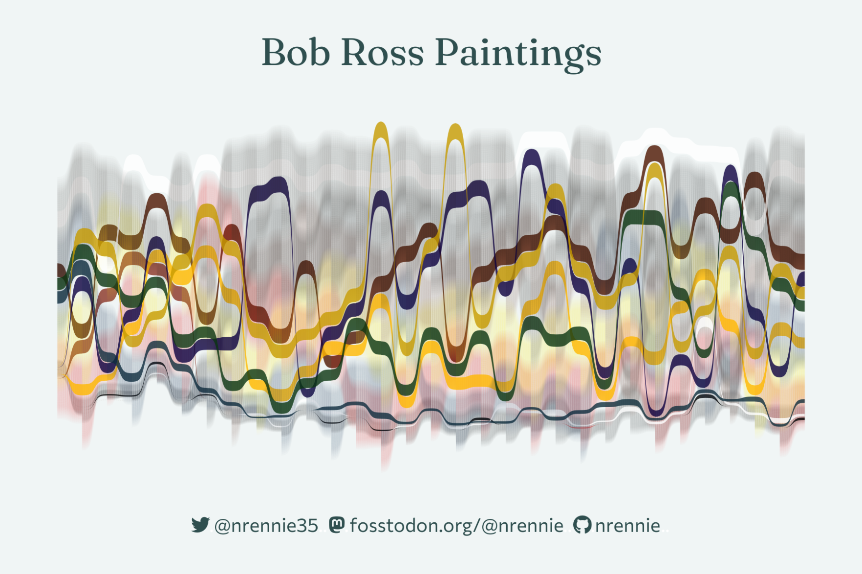
For the Bob Ross paintings data for #TidyTuesday this week, I went for a cross between data viz and generative art 🎨
I created a sankey chart to visualise the colours used across different seasons of the show! 🖼️🖼️
Code: https://github.com/nrennie/tidytuesday/tree/main/2023/2023-02-21
Jack Kennedy 🐀
boosted

Jack Kennedy 🐀
boosted




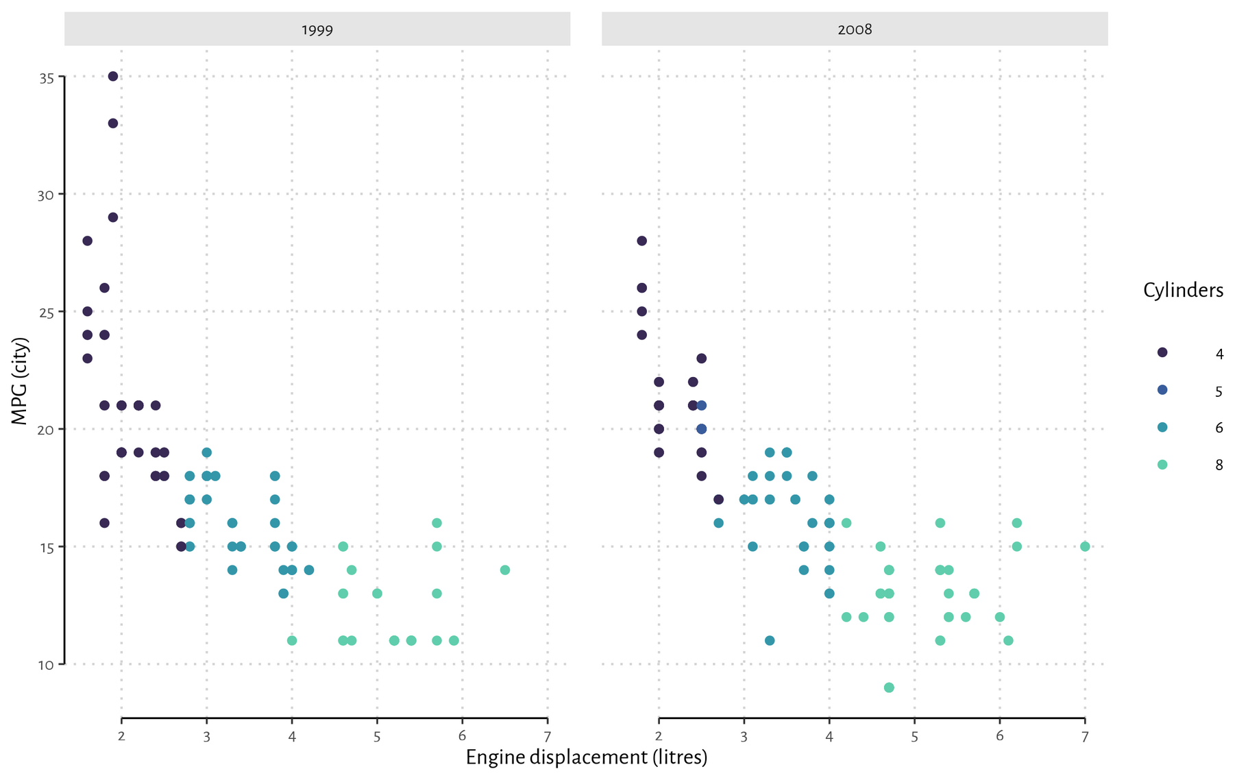
Have recently been playing around with `ggh4x`, which provides some nice drop-in extensibility for ggplot2.
E.g. Tufte-style "floating axes". (Very easy in base plot, but a bit of a pain in vanilla ggplot2.) https://teunbrand.github.io/ggh4x/reference/guide_axis_truncated.html#ref-examples
- https://twitter.com/_jcken
I have a stats PhD from Newcastle and work as a senior data scientist at UKHSA
Royal statistical society volunteer
🌲 🐕 🚵♂️ | views own | he/him
Joined Nov 2022
