
I have to repeat myself. Why isn't this on the headline of all newspapers?

@MartinStendel Just curious: does it look as alarmingly if the reference data would include 2012 to 2022 instead of stopping at 2011?
Follow

The page says chart from
https://climatereanalyzer.org/
But I didn’t found the same chart.
I found different ones
https://climatereanalyzer.org/clim/sst_daily/
https://climatereanalyzer.org/clim/t2_daily/
Maybe they changed the unit of y-axis

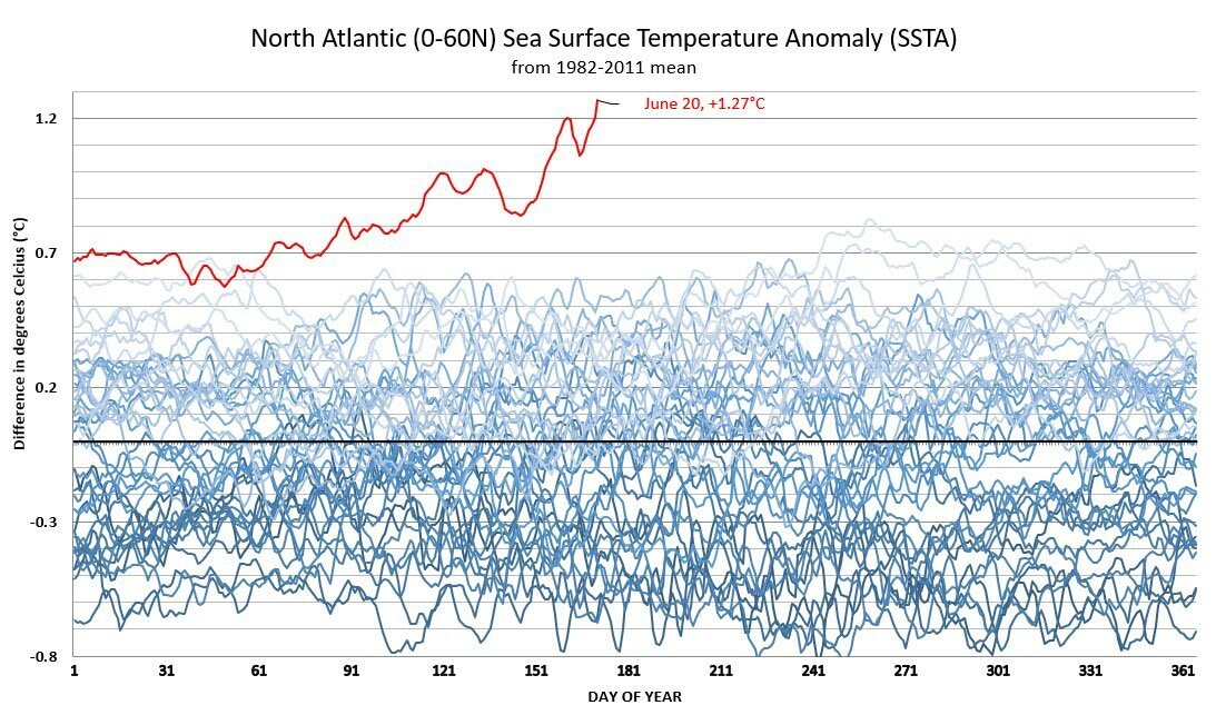
@ives @Acer @jon_wnc @MartinStendel I think the graph is showing lines for the last ~50 years, all normalized to the mean for the years from 1981-2011.

@Acer @jon_wnc @MartinStendel Thx for that link! I found this graph on the site. It has an absolute y-scale instead of the relative one in the graph at the start of this thread. Looks less spectacular at first sight, but it's also quite bad if you look at it more closely.