
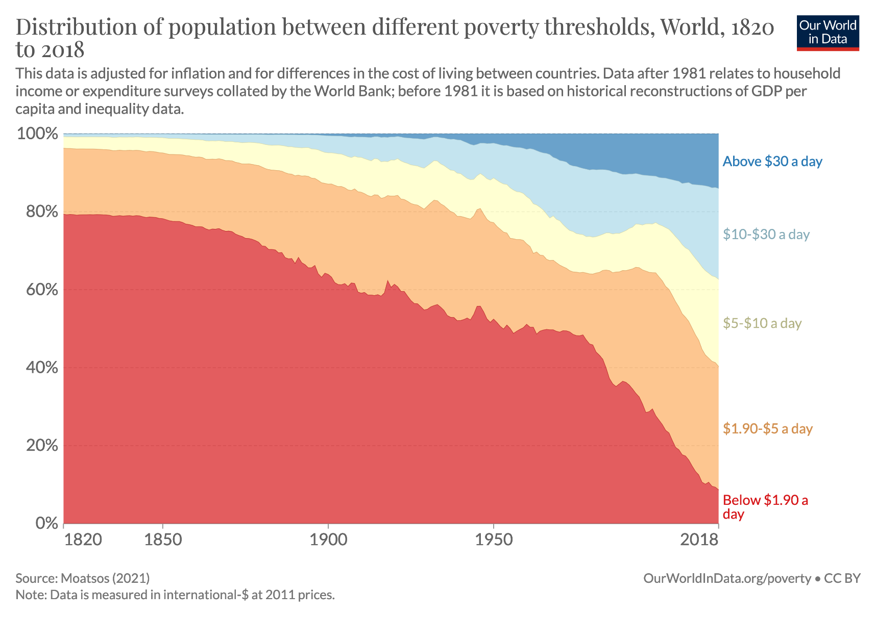
The long-run perspective on global poverty.
The chart shows that poverty declined relative to various poverty lines – most rapidly in the two decades up to the COVID pandemic.
This chart is from our page on poverty where we also discuss how the pandemic impacted global poverty: https://ourworldindata.org/poverty

@maxroser It would be interesting to see this chart without China (which, I think, makes up a sizable part of the decline). Is that possible to visualize?

@udittmer Check yourself at https://ourworldindata.org/grapher/distribution-of-population-between-different-poverty-thresholds-historical?country=~OWID_WRL
All the plots at ourworldindata.org are interactive and backed up with open data.
