

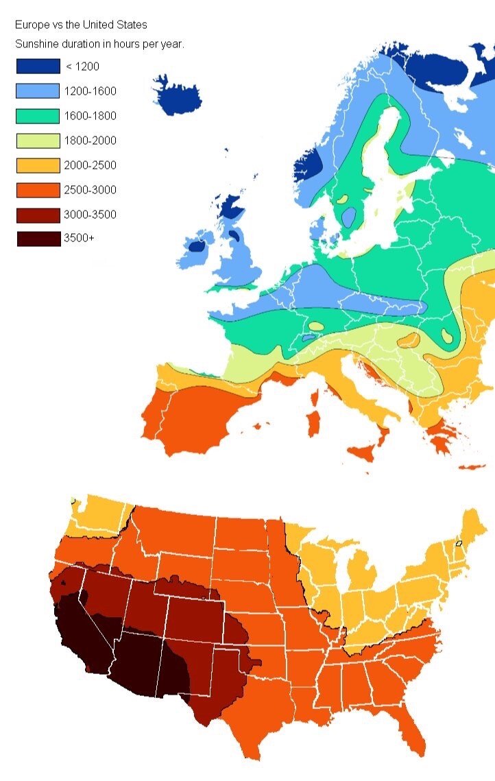
@TerribleMaps Wait, why would this not just be a map of latitudes? Is it taking weather into account?
@CCochard @TerribleMaps Based on the simplest physics of how much light a globe would get as it rotates on its axis, it would be a uniform color per latitude, but the equator would get more than the poles, so it would be a smooth gradient from equator to pole...
The question is what the origin of the longitudinal variation is... I assume it's due to cloud cover, but that's not indicated, so I'm not sure.

@LouisIngenthron @CCochard @TerribleMaps
New York is about the same latitude as Rome, so if you match those two it is a fairer comparison. It matches pretty well. Outside of that wind patterns and cloud cover.
Although, I seriously wonder about the days of sunshine listed for Northern California. San Francisco and Monterey Bay areas have LOTS of fog. It does not seem reasonable that they have more sun than, say West Texas. I lived in Monterey area and hardly ever saw any sun ever.
@LouisIngenthron @CCochard @TerribleMaps
I checked: San Francisco hours of sunshine per year: 2950 hours
https://www.usclimatedata.com/climate/san-francisco/california/united-states/usca0987
Monterey: 2838.76
https://en.climate-data.org/north-america/united-states-of-america/california/monterey-1470/
Map has them with 3500+
Also, :LA has 3250
https://en.wikipedia.org/wiki/List_of_cities_by_sunshine_duration
Map has California coast wrong.

@LouisIngenthron @TerribleMaps cloud formation, mostly.

@LouisIngenthron @TerribleMaps if it only took into account latitude it would be a uniform colour... The shorter winter day average out with the longer summer day...