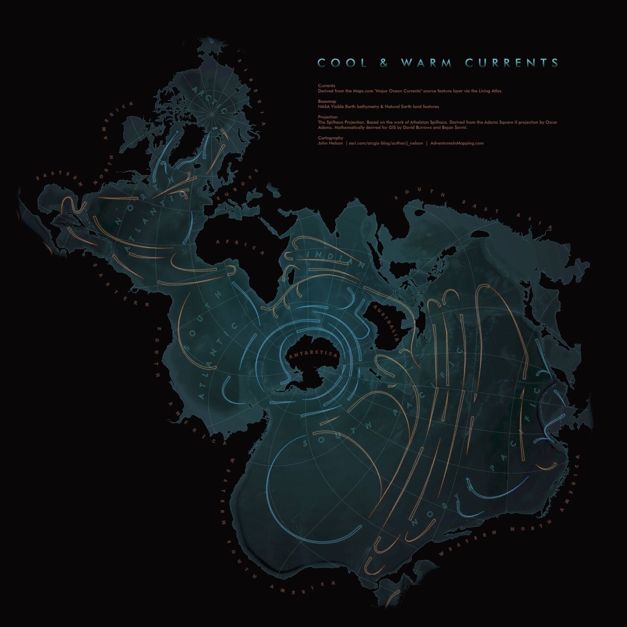
If you’re not an oceanographer, help settle a dispute between me and @helenczerski. She says no one would understand this Spilhaus projection image on first glance whereas I think it’s a great representation of the dynamic ocean. Who’s right?

esri.com/arcgis-blog/products/

@davidho @helenczerski I get that it’s current and temperatures, but the direction is a little ambiguous. I’m assuming the thick end is the forward direction, but the thin end is pointy like an arrow, so a part of my brain is tripping over this. Arrow heads would help.

Sign in to participate in the conversation
CleverLibre Social

CleverLibre Social is an inclusive social instance for open discussion, learning, and community.
All cultures welcome.
Hate speech and harassment strictly forbidden.