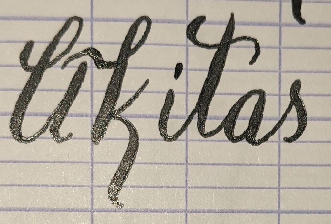
New style for both the capital A and lowercase K here. Thoughts?
#calligraphy #handwriting
@freemo Capital A is a bit difficult to read, but the k is downright pretty.
@freemo that lowercase "k" rocks
the uppercase "A" scans a bit like a lowercase "li" to me
@bonzoesc Agreed, see my post with an updated version.
CleverLibre Social is an inclusive social instance for open discussion, learning, and community. All cultures welcome. Hate speech and harassment strictly forbidden.

 🇳🇱
🇳🇱


@freemo Capital A is a bit difficult to read, but the k is downright pretty.