

… or that we're just autistic, me and you, @Blort
TBH I'm only half-joking, I've never went to be checked by a professional.

@mcsinyx
Well, it's a spectrum, so I'm a sense, pretty much everyone is somewhere >0 on the spectrum. The only real question is, how far?


@TheBuilder Why? Do you disagree? BRIGHT CONTRASTING COLORS are actually pretty distracting.
@lupyuen
@lupyuen I can totally relate right there. But isn't this the case for about everybody anyway?


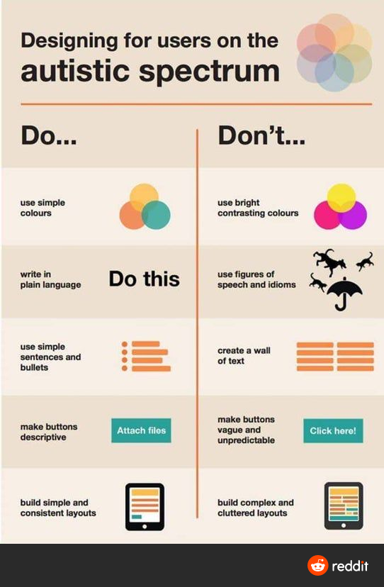
@lupyuen Thanks I will share this, useful info.
What do you make of back ground video things, they seem to be fast moving, move between different scenarios, I am not autistic but find them very distracting and annoying.
I am sure they make the designer think they are clever, but for me it puts me off the site.
@zleap Yep they look flashy ... But bad for accessibility
@lupyuen Indeed, thanks, So far I have not found the point in them either.
Most other providers such as the OU have a clean, simple website, easy to find information / courses, easy way to contact and ask questions etc, how things should be.
Make me rather concerned that if this is seen as a 'cool' idea it will end up on more websites esp if taught as part of courses that it is good to do that.
@zleap let's tell them it's bad! 🙂
@lupyuen Or let those who get it right, know they are doing the right thing,

@lupyuen
Sounds like good practice for designing for humans in general...