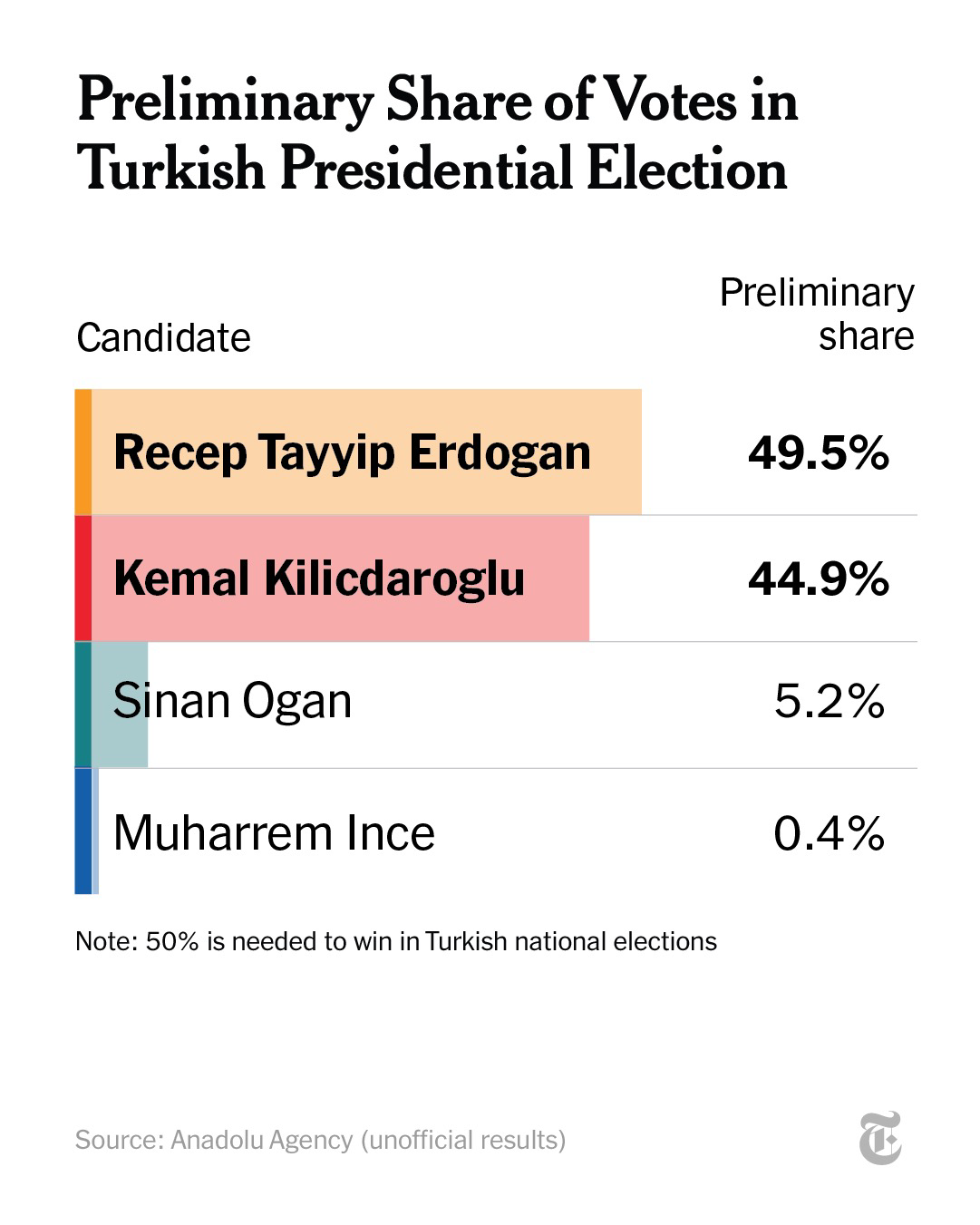
- Category labels in bars - Dual tints in each bar - Bold text for the two leaders - Right alignment of values and their title - Elegant fine horizontal lines - Enlightening annotation - Medium grey for source
CleverLibre Social is an inclusive social instance for open discussion, learning, and community.
All cultures welcome.
Hate speech and harassment strictly forbidden.