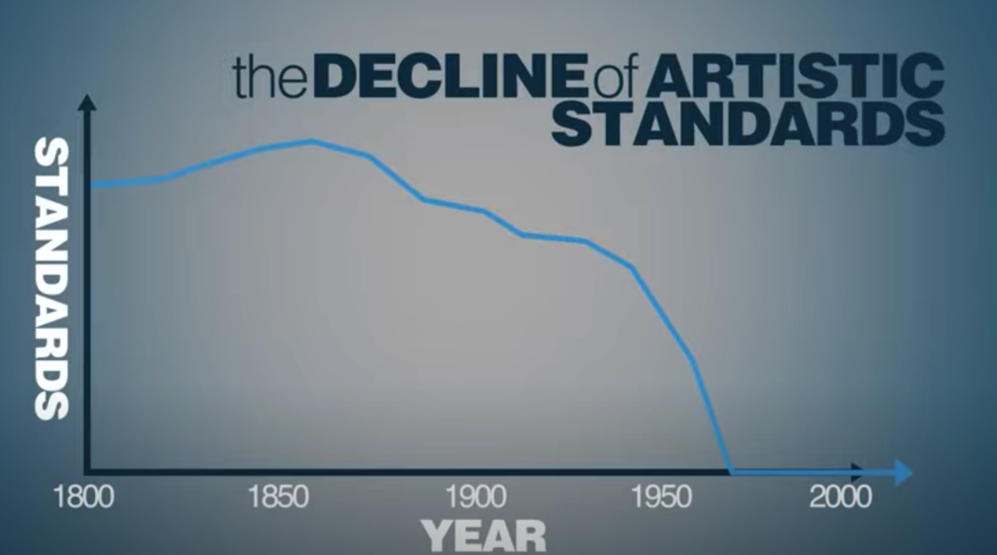
You may not like it, but this is the best graph in the world. The best graph that has ever emerged from the mists of data science. It's time to pack up and go home, there will never ever be a better infographic ever.
(Little known fact: the x-axis of this graph is at y=500,000,000,000 so while standards have gone down about about 248 they are still very very high.)



@ambulocetus Would love to boost this - can you add alt text?