
Follow

@kslazinski @numi
Hi Kris !
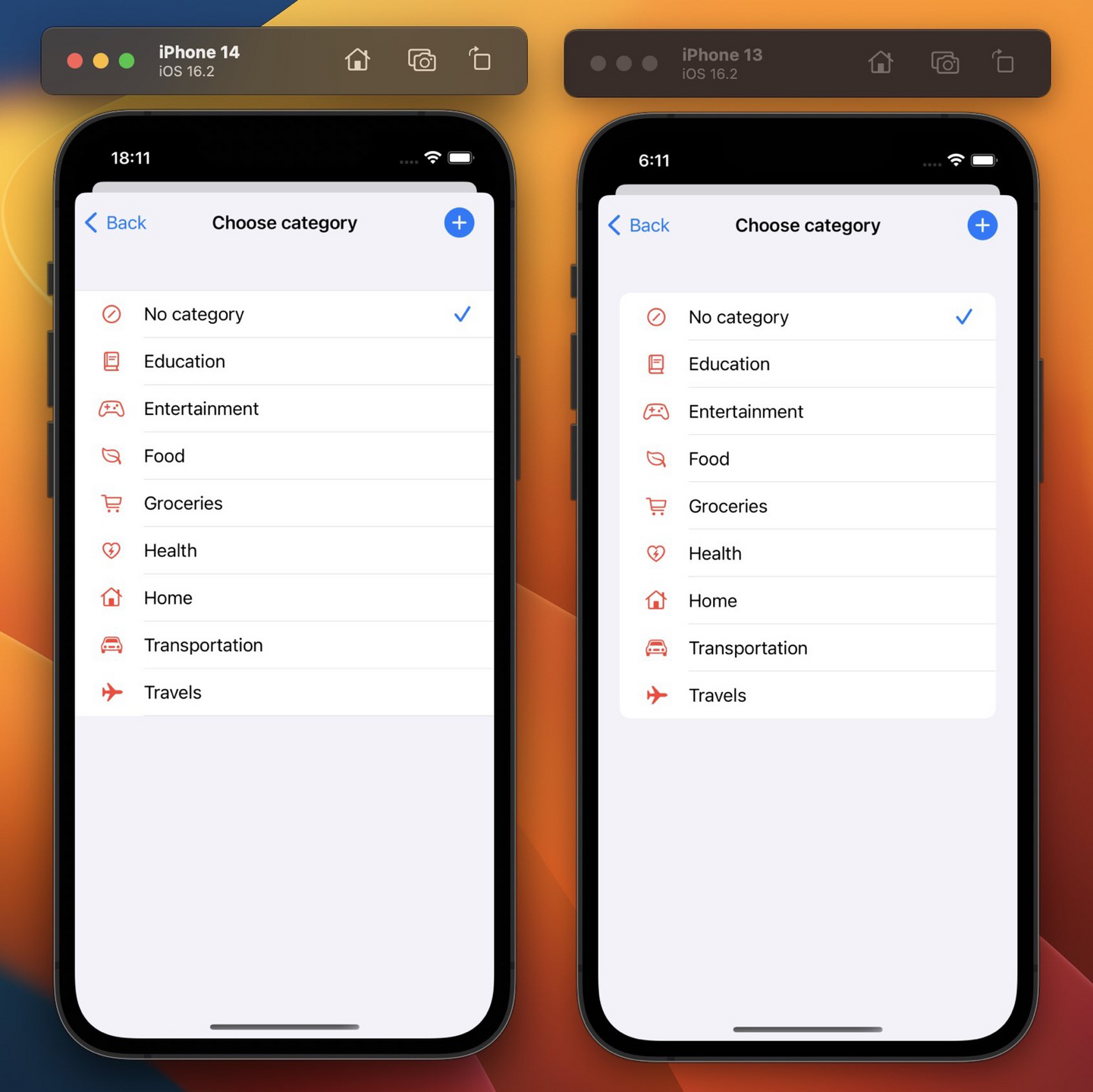
Left !
More space for text indeed and less visual information. (right design add rounded corner, margins and discrepancy between top/bottom buttons and other. All these visual info are not usefull for user guidance and are better avoided i think.)
So left for me.
(Then of course you should consider homogeneity with the rest of your app.)
have a good day

@homeomnis @numi Thank you very much. I prefer left one as well. Similar to what you said - it’s more minimal and I like it. But so far majority of people chose right one 😅 So I will probably go with that. I can always go back to previous design if this new one won’t work