
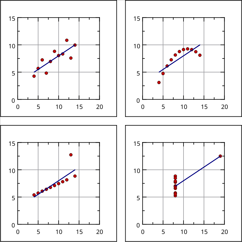
The importance of visualizing data. Part 1.

Anscombe's quartet comprises four data sets that have nearly identical simple descriptive statistics, yet have very different distributions and appear very different when graphed. The quartet is intended to counter the impression that "numerical calculations are exact, but graphs are rough."

The example is available in @LabPlot via File > Open Example.

#LabPlot #OpenSource #DataViz #Visualization #Statistics #DataAnalysis #AnscombesQuartet

Sign in to participate in the conversation
CleverLibre Social

CleverLibre Social is an inclusive social instance for open discussion, learning, and community.
All cultures welcome.
Hate speech and harassment strictly forbidden.