
Follow

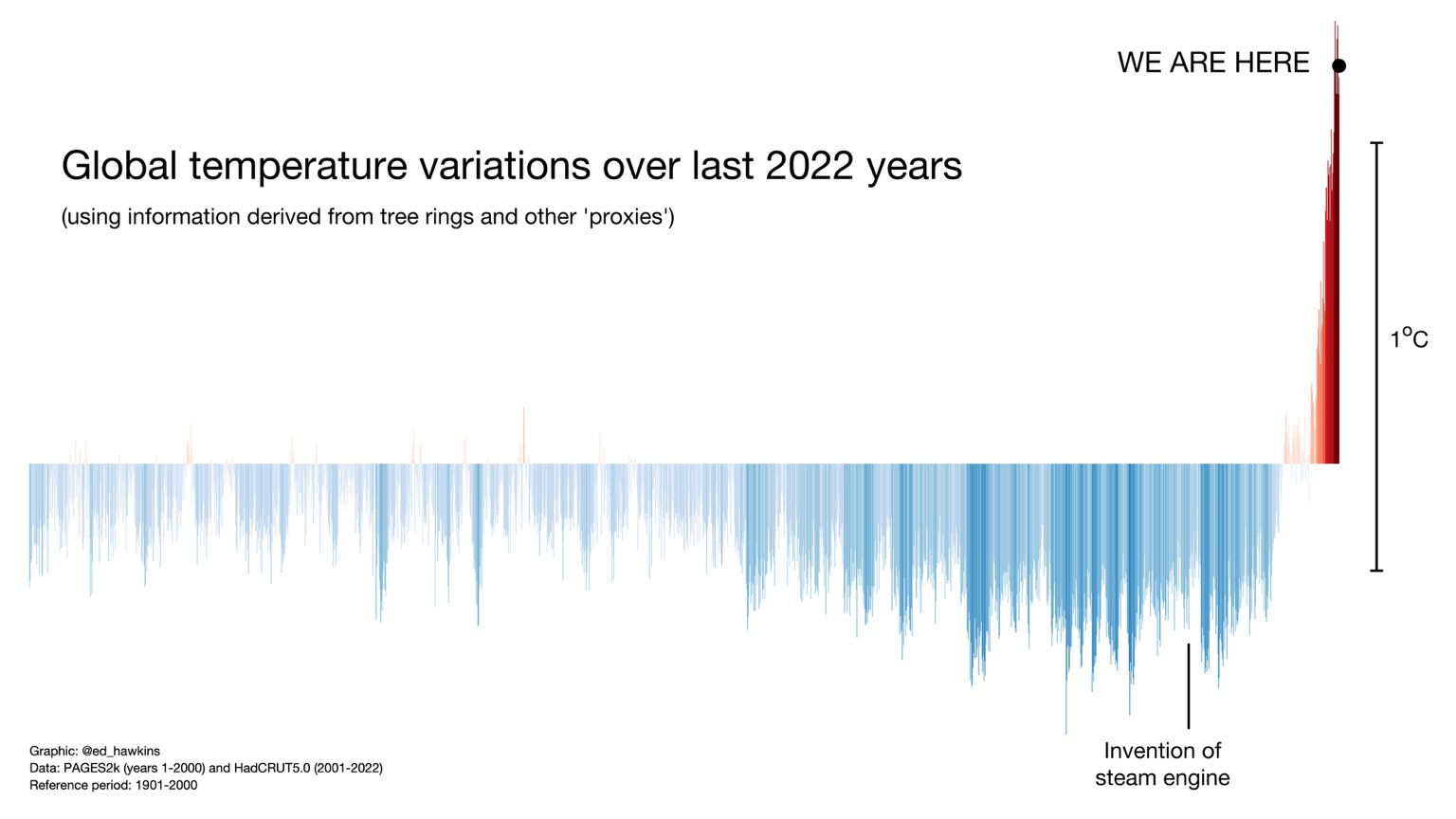
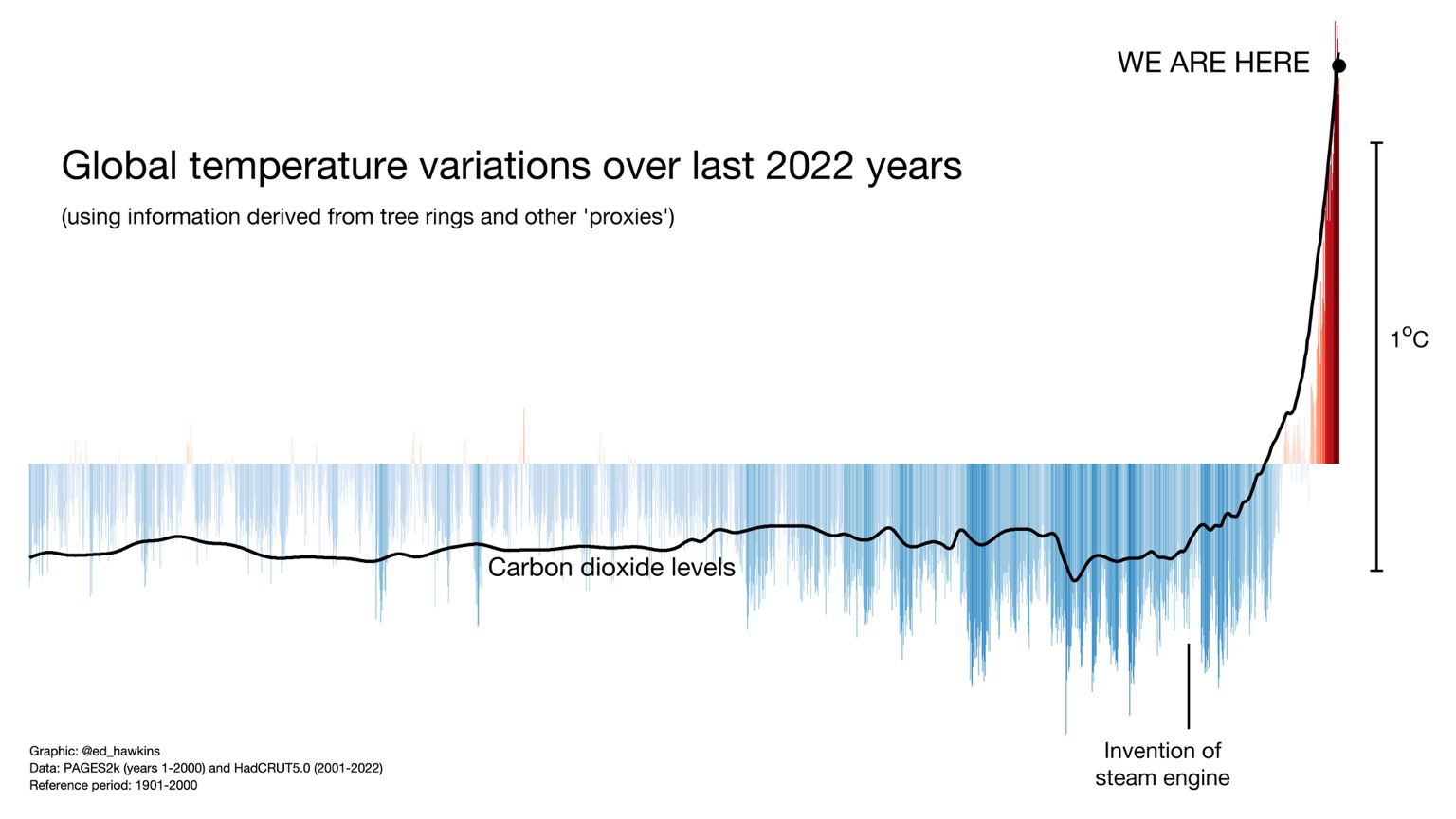
It's anything but simple and what this graph is saying is just that you have a very bad model because we don't see proportional effects at all.
Simple logic, understood for thousands of years.
So are you saying climate "scientists" show catastrophic graphs despite they know the actual effects are toned down?

@post
This is absolutely not what non-linear means... The graph shows measurements, I just told you why they do not look like what you expect. Do you even know what you are talking about? @ed_hawkins
I know dynamical systems, if you have something technical to add go ahead.
Please in your next comment include a reply to my question: is this graph intentionally misleading and some kind of metric of the effects should be presented instead?

@post
Have you ever heard of non-linear phenomena?
@ed_hawkins