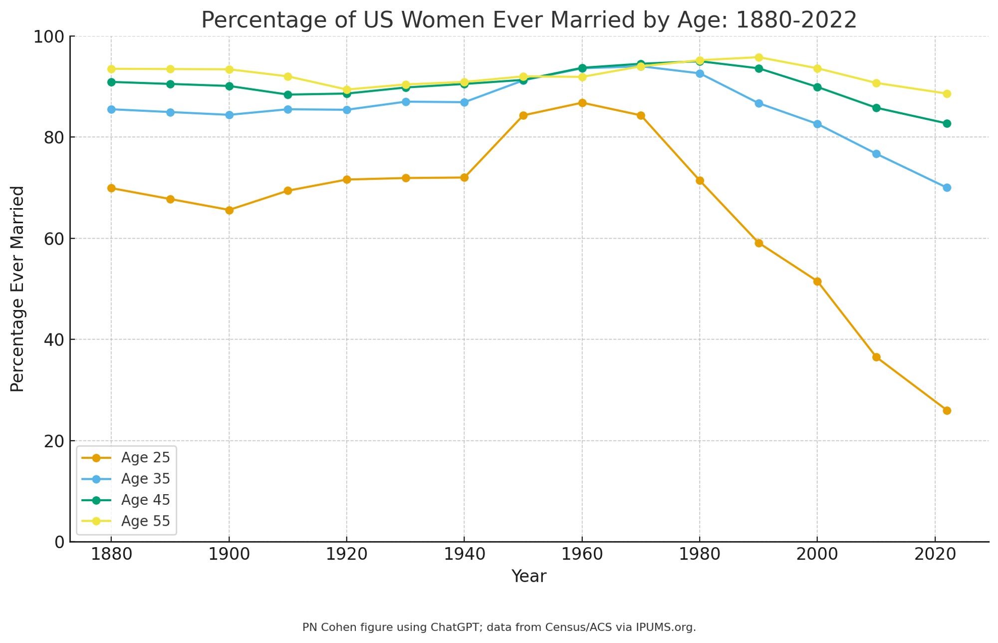
Huh, you can make graphs with #chatgpt. Took three prompts: first paste in the data points; then asked for more colorblind-friendly colors; then asked for a 0-100 y-axis and gave the footnote. It chose the graph style.
CleverLibre Social is an inclusive social instance for open discussion, learning, and community.
All cultures welcome.
Hate speech and harassment strictly forbidden.