
Follow

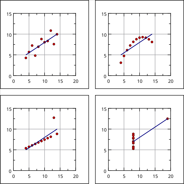
@onemoment @LabPlot See also the deluxe version: the Datasaurus Dozen.
https://blog.revolutionanalytics.com/2017/05/the-datasaurus-dozen.html

@onemoment @LabPlot See also the deluxe version: the Datasaurus Dozen.
https://blog.revolutionanalytics.com/2017/05/the-datasaurus-dozen.html