


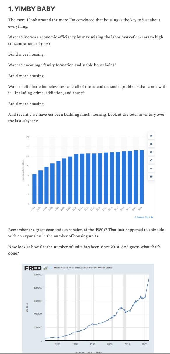

@twitskeptic @brendannyhan Those numbers are not per capita and are therefore worthless.
@arpcomics @brendannyhan@mastodon.soc US population increased about 7% since 2010 while housing starts increased > 250%.

@twitskeptic Crap, I missed the population part of the graph 🤦🏽♂️
The graph is showing thousands of units per thousand people. But we’re talking *millions* of people and *thousands* of housing starts.
The housing ‘growth’ begins at 2 units per 1000 people and jumps to 5 units per thousand people. Statistically that is 250% growth.
But for every 1000 people, at best the new units can house ~13 people (I’m generously assuming 2.5 people per family). That’s not even making a dent in housing supply.

@brendannyhan The cumulative plot of housing units is purposely deceptive. Look at the X axis of the cumulative plot of housing units. 5 year increments from 1975 to 2010 and 1 year after 2010. Embarrassing.